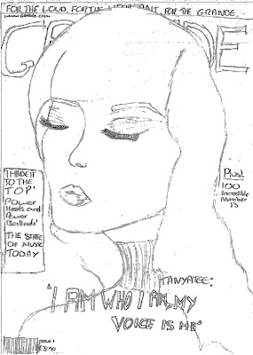
My seccond Cover Draft has a cover image of two female musicians,lng distance low angle shot giving the subject of the image power over the audience, the main cover image is partially covering the mast head/tital block suggesting that the contents is more important than the brand therefore broadcasting there cofidence in the quality of the magazine. the two musicians will have direct adress with the audience drawing them into the magazine. The two musicians will either be dressed in long dark dresses or the image will be shot in black and white. The main cover line will be in a serif font in the same color as the text in the mast head to make a clear link between the main focus of that magazine and the brand this suggest a quality to the audience because the brand is asscociating itself with it. I will have a black on red strap line with the red box in te same colour as the mast head, the text will be serif making a statement about the class and glamour of the magazine. The mast head will be a dark red or purple serif font on a black box to make it bold and stand out. on the right hand side of the cover i will have a black box with red text in it in the same colour as the masthead/main cover line and the strap to tie them all together. on the left hand side of the cover i will have a mid shot of a woman as a puff as to what else is in the magazine with a left justifiend coverline as an anchor for it. in the top right hand corner of my cover i will have a centre justified cover line with the number 100 in it which has connotations of 100% and perfection which will appeal to my audience.
My third Cover draft has a big close up, straight o n shot of a female singer, the singer will be wearing a bowtie and a top hat and the image will be shot in black and white leving only her red lips in colour. The Mast Head will lay across the top hat in the cover imge leaving the face of the singer clear so that her eyes are the focus point making the direct adress successfull. The strapline will be white capital sans serif font on a black box so that it stands out with the magazins motto. The Mast Head will be in either a deep red or purple in a serif font across the top third of the magazine cover so that is it shouting out the brands name, this has conotations of the magazine being something that people should be proud of being seen with, that it is a desirabl accessory, this will appeal to the aspirers in my target audience. The Main cover line will be a serif font that is different from the mast head but in the same colour tiying the brand to the focal contents of the magazine. The coverlines on my cover will be black serif fonts either right or left justified depending on where they are on the cover.


No comments:
Post a Comment